Creating a Clean, Contemporary Look
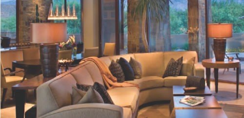 Waxing and waning since its beginnings in the latter half of the 20th century, contemporary home design is currently enjoying a renewed popularity. Demanding careers and hectic lifestyles have led many homeowners to embrace its clean, simple lines. Often suffering from “opportunity overload,” they find respite in homes with less fuss and fewer details.
A trend toward warmer and softer elements has also given today’s contemporary design a broad appeal. The high gloss of the 80’s is frequently toned down – or replaced with interesting texture. Rich wall colors of medium intensity create more relaxing spaces.
The mantra of contemporary design enthusiasts is “Less is More,” with the emphasis on thoughtful design highlighting selected focal points. Lee Mink, ASID, owner of Lee Mink & Associates Interiors in Pasadena, California, compares contemporary design to a classy, black sheath dress. “Accessorize it with an elegant string of pearls, and the pearls receive the attention they deserve. But if you add the same necklace to a ruffly, flowered dress, it can get lost.”
 Principle 1: Open, Bright, Airy Spaces
Thoughtful contemporary design can be achieved through seven overriding principles. “First of all, contemporary homes are very open, bright and airy,” begins Design Basics’ award-winning home designer Marshall Wallman.
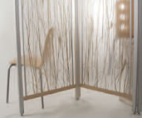
“Fewer interior walls result in long views from room to room, particularly in the primary living spaces,” Wallman continues. “This doesn’t mean that different areas are not defined, however. For instance, a dining room may be set apart by a half wall, a see-through shelving unit or a room divider with an open design.” “One of my favorite contemporary room dividers is a resin panel with decorative material incorporated,” remarks Beth Settles, ASID, of Interiors Joan and Associates in Omaha, Nebraska. “Offered by Lumicor and 3-Form, the translucent panels have textiles, papers, metals, natural foliage or wood veneers embedded.”
(For more information, go to www.Lumicor.com or www.3-Form.com.)
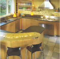
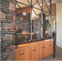 “Different ceiling treatments are also used to distinguish certain areas,” Wallman notes. “A faceted ceiling could be created to highlight the dining area, while a dropped soffit over an island can provide the kitchen’s boundary.”
“Rather than breaking up the flow in the open living spaces, flooring is often one continuous, neutral color throughout. Hard surfaces are more popular: slate, porcelain or ceramic tiles, or wood– in wide planks for a clean, uncluttered look,” observes Design Basics’ Design Consultant Janie Murnane. “Area rugs with geometric patterns add color and divide spaces. “Staircases, on the other hand, are generally carpeted – sometimes in a bold color or an interesting pattern. I’ve also seen the main floor’s wood flooring brought up the sides of the staircase with a carpet inlaid in the center portion.”
“Using a carpet with a geometric pattern or a lot of flecks on the steps is practical too,” Mink adds. “Stairs take a lot of abuse, especially if there are children in the home, and something with a design won’t show a traffic pattern nearly as much as a plain solid.” Large expanses of glass flood contemporary homes with sunlight, according to Wallman. “Extra glass on interior walls spreads the light to other areas. For example, I’ve used glass French or pocket doors between an entry and a den. This blocked out noise, while keeping both spaces airy. I’ve also used a lot of interior transoms and wall-length strips of glass just above the door and windows.”
Principle 2: Simple, Clean Lines
Understated elegance is the overriding theme of the contemporary home. “Windows have few grids,” explains Wallman. “Baseboards and window trim have simple profiles: either a gentle rounded shape or wide and flat. Crown moulding is smaller or even omitted. Instead, a small banding may be created using a 1 x 4 piece of trim three-fourths of the way up the wall (even with the tops of doors and windows). If the wood is angled, rope lighting can be hidden behind it to provide a band of soft light. Banding can also be achieved with an untrimmed drywall projection. In both cases, the walls may be painted different colors above and below the banding.”
“To achieve a greater sense of flow, ceilings are often painted the same color as the walls or a few shades lighter or darker,” says Settles. “Ceilings are normally pretty clean, but I have seen a series of drywall cut-outs with rounded corner beads and tray lights.”
Floating ceilings are another interesting option, according to Lori Carroll, the 2006 National Kitchen and Bath Association Pinnacle of Design winner and president of Lori Carroll & Associates in Tucson, Arizona. “I once worked on a home that had a sloped ceiling we wanted to make flat. So we floated a whole ceiling from the kitchen to the family room and installed perimeter lighting. In the evening, the room glowed from this wonderful indirect lighting.”
 In the kitchen, range hoods may be wood, metal, tile, limestone or drywall, with little ornamentation. Cabinet doors can be completely flat or trimmed minimally. To create more uninterrupted planes, enclosed glass display areas may be added to extend the cabinets to the ceiling.
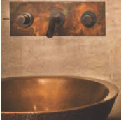
In the bath, plumbing fixtures are sleek and sculptural. Kohler’s Purist suite offers minimalist-style faucets, sinks, vanities and bathtubs. The line’s Hatbox Toilet epitomizes streamlined design. “Vessel sinks are very hot and there is an amazing array of choices… from porcelain, copper, stainless, concrete, granite and glass,” notes Settles. “Stone Forest, Sonoma Stone and Oceania are a few companies with very unique offerings.” “One way designers create a large, simple plane in the bath is by extending the mirror over the vanity all the way to the ceiling,” Wallman reports. “Then the light and plumbing fixtures are actually mounted through the mirror.”
Glass is another material that naturally lends itself to clean, simple design. “We have so many great choices in textured glass today; I use it all the time in various applications,” says Carroll. “Sometimes it’s a front entry door where it is almost a piece of artwork. Other times it’s a glass countertop in the kitchen – which isn’t as high maintenance as clear glass would be. I’ve also used it as shelves in the bathroom, in place of glass block windows and in round showers where you need templated glass that’s radiused.
Principle 3: The Use of Repetition
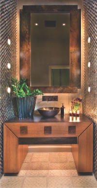 “One of the soothing aspects of contemporary design is the rhythm or cohesiveness provided by the repetition of various design elements,” observes Carroll. “I did a bedroom/bath area where I repeated a square shape. The fronts of the cabinets had some square, glass insets. The knobs were square. And I created an interesting pattern on the floor using squares. Attention to those little details makes the whole more complete.”
“ I designed a home that used square niches of different sizes in a bedroom and in the bar area,” says Wallman. “You can also repeat a pattern, an angle or a curve. If the kitchen island has a distinctive curve, you can mimic that with the track lighting or the soffit. You might have a series of three tall windows topped with three short windows repeated throughout the home. Or, a pattern could be repeated in tiles on the floor, a kitchen back splash and a wall in the bath, even though the tiles might be different sizes or different materials.”
Principle 4: Providing Contrast
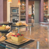 “Contrasts elevate interest by mixing different colors, qualities and materials,” Settles notes. “ I’m doing a kitchen now that has light maple cabinets with mahogany trim at the bottom of both the upper and base cabinets and down the middle of the range hood. In other homes, I’ve used dark, espresso cabinets with a light wood floor. I’ve also mixed knobs with long, linear handles on cabinetry. And I’ve mixed stainless or copper accents with tiles on the back splash and the area above the range hood.”
“ I often mix two different types of wood or wood and textured stainless steel in bath cabinetry,” says Carroll. Wallman likes to mix materials on fireplace mantles.“ You can get some interesting effects by combining wood and stainless steel, for instance. Staircases also lend themselves to a variety of elements. I’ve mixed wood with glass panels and a couple different types of wood (cherry and maple) with wrought iron.”
Principle 5: Materials with Intrinsic Interest
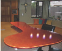 Patterns and textures offset contemporary’s smooth, clean lines and provide a softer, warmer feeling. “A lot of interesting wall coverings are coming in,” notes Carroll. “ Innovations has a covering made up of little glass beads that provides a lot of impact.” “ I often use commercial wall coverings in contemporary homes, including coverings with geometric designs, grass cloth and papers with faux finishes,” adds Settles. “Faux painting techniques can also provide tremendous depth and details.”
 Exotic woods are popular in high-end, contemporary kitchens, including teak, wenge (pronounced when-gay), zebra and bubinga (for more information, go to www.Exotic-Wood.com). “I’m doing a kitchen right now using wenge cabinetry, with the grain running horizontally,” Carroll says. “I really appreciate its unique, aesthetic value. It’s a dark wood with a very specific grain.“ In Tucson, I often create interesting details with tiles–large slates and smaller mosaics–in kitchen back splashes and behind powder room sinks. I’m working on a powder room right now with an incredible, handmade glass tile. I also like to use slate on floors because it offers texture and a variety of color.” Settles praises Oceanside’s brilliant glass tiles. “They have textured tiles, iridescent tiles with a metallic quality and tiles rated for use on floors. I use them to create back splashes, countertops and frames around bath mirrors. I mix them with ceramic or porcelain tile to create patterns. I’ve also covered a whole bath wall with them.”
Principle 6: Bold or Soft Color Schemes
“Color schemes can be bold or soft,” Murnane states. “ You might paint most of the walls in a single, neutral color and then paint a few accent walls bright red, royal blue or a deep green. Or, you can stick with natural materials and earth tones. This not only creates a softer, warmer look, it has the advantage of being timeless– since natural materials don’t change with passing trends.
Black is often used to ground a contemporary room, which is probably why black granite is so common for kitchen countertops.” Metal can be striking in counters, back splashes and even cabinetry. Homeowners with tighter budgets can get a similar look with metallic-looking laminate countertops and back splashes made of metallic-looking tiles. At the same time, it’s important to remember too much metal can give a room a cold, clinical look. Carroll is getting away from stainless appliances in the kitchen. “I’m doing more colors – taupey grays, blues and reds. In fact, Viking has just brought out various colored microwaves to coordinate with their appliances.” (For those not willing to commit to permanent color in their appliances, KitchenAid and other manufacturers sell appliance panels in several colors.)
Principle 7: Including an Element of Surprise
By its nature, contemporary design is innovative and experimental. “You’ll find more asymmetrical elements,” Wallman comments. “ It may be a faucet that’s off-center, a fireplace surround that’s larger on one side or a ceiling that’s vaulted in one direction (as opposed to a cathedral ceiling).”
Contemporary design is fun; it often includes an element of whimsy or surprise. An entertainment or game room might enjoy wood flooring comprised of interlocking puzzle-piece patterns.
Funky hardware is sometimes incorporated, perhaps some martini glass knobs in a bar area. One of the homes Wallman worked on had little men holding the lighting fixtures onto the rail system.
Sometimes an unexpected element provides the surprise. “In one contemporary home I did, I used an antique cabinet, put a very contemporary bowl on top of it and designed a beautiful stone wall behind the sink,” recalls Carroll. “It came together very well.”
Like the classic black sheath, today’s contemporary design epitomizes great lines, interesting materials and simple elegance– providing the perfect background for selected focal points.

 Principle 1: Open, Bright, Airy Spaces