the DECADE OF CHANGE
2003-2013
The past decade witnessed excessive fanfare for record high new home sales, followed by incessant media coverage of the housing recession. Almost lost amidst all the noise was the fact that home design preferences quietly continued to evolve.
An increasingly casual lifestyle.
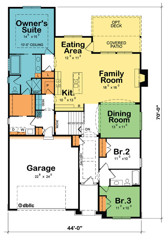
Formal dining rooms were still common 10 years ago, but already were heading the way of the formal living room. We heard comments like “360 days a year the dining room is a waste of space. And the other 5 days it’s really not big enough.” A single eating area, open to the kitchen and freely-flowing into an adjacent entertaining area became part of the new “entertaining core” plan design concept.
The rear foyer concept came into its own. According to a 2011 study by Recon Analytics, people who have an attached garage go in and out of their home using the door between the home and the garage 92% of the time, rather than using the main (front) entry door. This led to envisioning the entry in from the garage as a “rear foyer” rather than the mundane mudroom/laundry.
The rear foyer serves as a vital transition space, a place to remove and store coats, backpacks and computer bags, shed shoes, and keep clutter out of the kitchen. Unless there is simply no other option, you probably don’t want the washer and dryer in your rear foyer either (who wants to trek past the dirty laundry—and be reminded of all that work—every time you arrive home?)
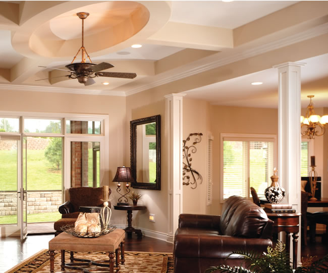
Where does designWhere does design innovation come from?
LISTENING.
Storage, storage, storage!
Bigger kitchen pantries are just one evidence of a new emphasis on storage. Bedroom closets are another, whether it’s a 6-foot walk-up closet in a modest secondary bedroom or spacious walk-in closets in the owner’s suites. Family-size coat closets replaced those little 18-inch to 24-inch wide closets that quickly overflowed and were expensive to trim out. Ditto for linen storage, eliminating comments such as “C’mon guys! I’ve got a king-size bed with king-size sheets, blankets and comforters, extra pillows and pillow cases, not to mention bath and beach towels. This isn’t a linen closet...it’s a joke!”
The three keys to successful storage in today’s homes?
1. Organization products and systems within storage to maximize its usefulness.
2. Situating storage exactly where it’s needed (think drop zones, storage in the laundry room and well-thought-out kitchens).
3. And there’s just no substitute for adequate square footage devoted to storing! Let there be light!
As a nation, we’re getting older and as we age, we “see” less light. While building codes require a minimum amount of daylight, it’s just that. Minimal. While adding windows is often an expense trade off when building a home, lots of buyers select home designs with lots of windows. Especially impactful is having windows on two sides of a room, ushering in natural light from two directions.
Kitchens and bathrooms, in particular, are being designed with more light. Under-cabinet lighting soared in popularity and more recently, skylights have experienced a resurgence in desirability, which just makes sense when you figure that a skylight, due to its angled orientation to the sun, passes three times as much light as an identical-size window installed in a vertical wall. Additionally, today’s homes offer more control over (electric) light levels rather than simply turning all the lights “on” or “off”.
Narrower homes and homesites
While “McMansions” may have been more common in new construction a decade ago, as the housing market has rebounded, so has buyers’ appetites for square footage. Yet, building homesites generally are trending narrower to hold down the overall cost of that new home. A decade ago, “narrow” home designs were generally understood to be up to 50 feet wide. Today that same definition of narrow may mean homes up to 40 feet wide—or even less. These narrower homes, to accommodate buyer’s square footage preferences, have generally stretched deeper. Consequently, designers’ attention has had to focus on eliminating the narrow/long (“cattle chute”) entry hall.
Plan #42223
Ceiling details, arched openings and
niches/display areas all provide visual
interest, minimizing the perception of
longer entry halls.
Shhh…
In our hectic, noisy lives, at least one environment can be quiet—our homes. The yearn for serenity has been a major force in dropping ceiling heights from tall, two-story high great rooms to a more controlled ceiling height such as 11-feet, which still offers the drama without the noise echo.
Products for the home play a huge role in reducing noise. A dishwasher installed in an island will be louder than if it is installed against a wall. Solid core doors, quieter appliances, bath fans and even soft-close cabinet hinges all contribute to a serene home.
Plan #50039
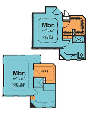
As envisioned for the customer in Austin, Texas. See the original floor plan and yet another variation.
Multi-generation homes
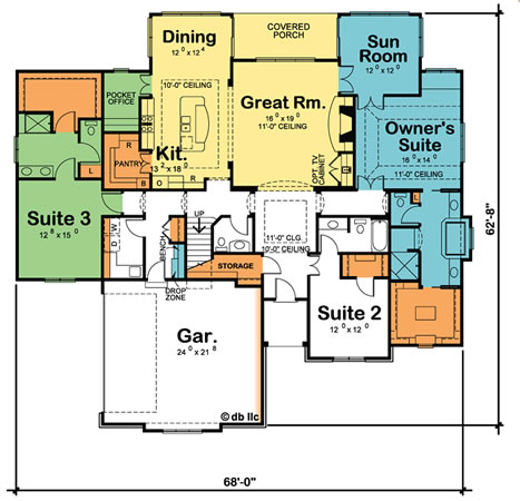
We recently talked with a woman from Austin, Texas, who was looking for a one-story home design with three owner’s suites for her and her two sisters. All of them were now single, and they wanted home ownership and companionship rather than apartment or condo living. From moving parents in to college graduates returning home under a mountain of student loan debt, home designs offering at least a guest suite or a full second owner’s suite are a hot item. Placing the second owner’s suite on a separate floor of the home (i.e., in a finished lower level or second floor) affords more privacy. Finally, there continues to be a strong percentage of “duplex” or “twin home” buyers who take one side of the home for themselves and the other side accommodates their extended family.
78% of Adults don’t take baths
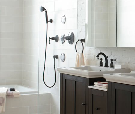
When over 4000 people responded to Design Basics survey indicating that they NEVER use the bathtub in their owner’s suite, it should come as no surprise that tubless owner’s suite bathroom designs are wildly popular. “I’m tired of dusting the tub” was typical of what we heard. Admittedly, there has to be a bathtub in one of the home’s bathrooms, but even REALTORs concur, if the home doesn’t have a really nice shower, buyers move on to look at the next home. Is it any wonder the most popular home remodeling project is ripping out the tub in the owner’s bathroom and installing a big shower?
“Give me back a little more time.”
“ Maintenance-free” and its cousin “low-maintenance” are in demand. Scrubbable paint…surfaces that don’t show fingerprints…composite decking…LED light bulbs…doorless walk-in showers…all give homeowners back a little more of their time for things which are truly important.
Plan #42231
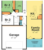
Though just 39’-wide, the Sunset Gable plan still offers a 23’-wide garage! Notice also the pocket office tucked in behind the stairs.
Larger garages
Design Basics 3 top selling plans 10 years ago had garages measuring 20-foot, 20-foot 8-inches, and 21-foot 4-inches wide, respectively.
Single-wide garage doors measured 8-foot wide by 7-foot tall, and double-wide garage doors were 16-foot wide. When building lot widths allow, a 24-foot wide garage is most popular today, coupled with either twin 9-foot wide garage doors or a single 18-foot wide garage door (either measuring 8-foot tall). Even in narrower homes, serious effort is made to offer at least 22-foot wide garages.
At the same time, designers are trying to de-emphasize the garage’s impact of the home’s overall appearance from the street. Restrictions are being put into place limiting how far the front of the garage can protrude out from the front of the house. Numerous architectural elements are also used to draw attention away from the garage door—which is many times the single largest design element on the front of a home. Of course, selecting an attractive garage door reduces the likelihood it will be seen as an “eyesore”.
Flexible spaces
Estimates suggest there are as many as 38 million home-based businesses in the United States and another 45 million U.S. adults bring work home to finish after a long day at the office. The most successful home designs today offer well-thought-out working from home solutions, from the dedicated den/home office to the modest-size pocket office concept, to dual purpose rooms such as a den with a wall bed so that that space easily converts to a spare bedroom.
Another new home favorite today is hobby and craft areas—often found in an expanded laundry room. Hard surface flooring and a sink for easy clean-up make this an ideal space for messy pursuits or where projects-in progress can be left undisturbed.
Finally, personally-tailorable spaces in homes are becoming deal-clinchers for buyers. Examples include pet centers, planning centers, and travel centers.
Improved accessibility Universal design elements are showing up in varying degrees in today’s new homes. Some, like wider halls and minimum 32-inch wide doors, are now dictated by the International Residential Code. Other features such as “curbless” (a.k.a. “roll-in”) showers, raised dishwashers, zero barrier entrances to the home and more spacious bathrooms help ensure everyone who visits your new home will be welcome.
Female home buyers have been driving almost all of these evolving preferences in residential design. Where does design innovation come from? LISTENING. Listening to the things home owners and prospective home buyers want or would change. Not that the homeowner needs to solve the issue—that’s the designer’s job. As designers we take our cues and our inspiration from you. So please, continue to inspire us to develop welcome new design amenities by sharing with us your challenges and dreams for the perfect home!
