Research confirms what home builders have long known – women are the primary or sole decision maker in the majority of new home purchase decisions. Which neighborhood… builder… floor plan… countertops… embracing women’s preferences in the home is Marketing 101 – “know thy customer.”
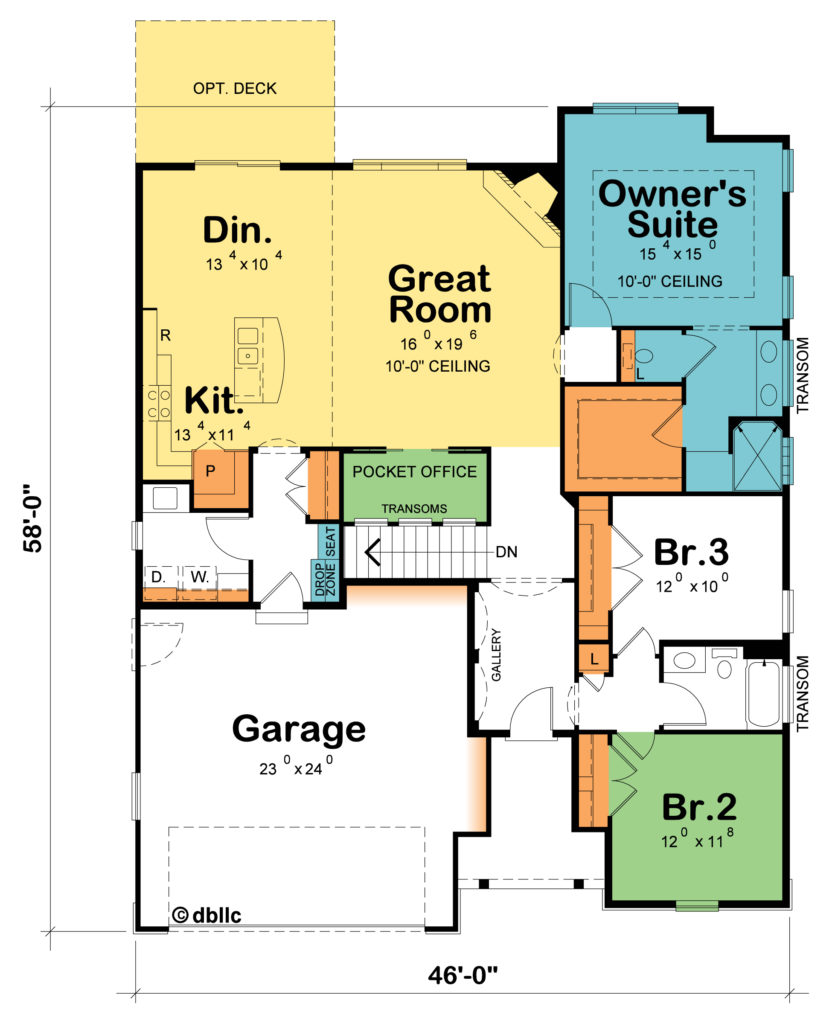
Husband and wife walk into a model home of the Hickory Cottage (plan #42235), pausing in the entry to remove their shoes. He’s seeing the great room’s corner fireplace; she’s noticed that the 6’-9” entry hall is wider than expected, the twin display niches on the left, repeating arches on all sides, the hickory floors, swank light fixture, and paint colors. Men tend to fixate on a single, often long view, focal point (think spotlight), while women tend to take in more of the whole picture and pick up more on the details (think floodlight).
With two young children, she’s looking for a layout with all of the bedrooms near each other, and at least for the time being, the bunk beds would fit nicely in BR 3, freeing BR 2 for use while her husband is still working from home. More than men, women tend to think about a new home purchase through the eyes of everyone in the home.
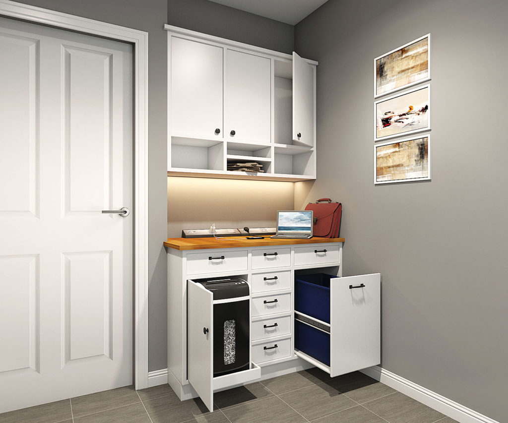
He picks up on the garage size and in particular, the big 18-foot by 8-foot high garage door. She tends to appreciate the garage size a bit differently, noticing especially the 20-inch recess at the back and 16-inch recess along the side for storage, minimizing hassles of traipsing around bikes and outdoor products. Coming in from the garage, they both appreciate the Drop Zone and closet, but she’s keener on the seat. And while he becomes aware the laundry room is off the rear foyer, she values having a window, sink, folding counter, and storage!
Storage is one of the “lenses” women have told us they use in evaluating home plans. In keeping with the idea that “storage can be beautiful,” she catches the cabinet-style twin doors into the deep kitchen pantry. So also, the quiet, soft-close cabinetry hardware, as women take in more through their senses than men.
The sunny sitting area at the rear of her suite’s bedroom brings visions of curling up on the chaise with her newest book. In the bathroom, she favors the doorless walk-in shower because it eliminates the task of squeegeeing the shower doors as well as the visual appeal and privacy of the glass block window. Transom windows over the vanity enhance applying makeup, another consideration she cares about that’s not on his radar screen.
The bottom line? Woman-Centric home design is better. From innovative solutions to improved livability and style, Woman-Centric home design talks to women (see also: Homes Talk To Women). That connection, on an emotional level, says to her that this builder cares, and that she/he understands what’s important to her.
Which is where we pick up next time – home builders having embraced this Woman-Centric approach in their businesses.
For more resources on thoughtful design:
- Visit our blog
- Browse our Her Home™ Magazine
- Thoughtful Design Concepts
Photo credit:<a href='https://www.freepik.com/photos/house'>House photo created by pch.vector - www.freepik.com</a>


Also like that the mud room & drop zone are off the garage door as that’s really the one we all use, not the front door. Curious as to why there are transom windows in the pocket office as I don’t see any natural light coming in there? And my preference would be to put the pantry in the corner as I find most corner cabinets waste too much space.
Thank you for your feedback! You are spot-on with the rear entry foyer – in other information about Woman-Centric design we note that over 90% of the time we enter/exit through the garage, and we want that laundry room to be it’s own space, not stepping over laundry baskets and such when we come and go. We added the transoms in the pocket office to add visual appeal, and even though not a natural light source in that position, it does pull in light from the home. And, moving the pantry to the corner is a great Plan Customization option we offer our customers! Thanks for following Her Home!
I agree with your woman-centric philosophy. I would like to point out a kitchen design flaw I see in the Hickory Cottage floor plan accompanying this article, and the same flaw is in many of the new homes being built today. The kitchen plan does not have room for very many drawers. The island is too small for any drawers and has no useful counter space as far as cooking preparations are concerned. There is very little useful counter space. There is only room for drawers under the short run of counter between the stove and the fridge. The corner space to the left of the stove and right of the pantry only really has room for either a lazy susan (preferred) or awkward base cabinets that have inaccessible space unless you have a small child that can crawl in there to get pans for you. Plans like this are not made for people who actually cook.
Thank you for your feedback! One appeal of this layout is affordability while meeting several requested design features: the large walk-in pantry helps offset storage – as pantry space costs less than expensive cabinetry. You are correct, if you are a serious cook, you would not be drawn to this design. The good news is we have over 2,800 floor plan options in our plan library, or the plan can be customized. Reconfiguring the kitchen, you could delete the pantry as designed and extend the kitchen cabinets (as well as add storage to the laundry room). Then, if you didn’t need the pocket office, you could convert that space into your pantry. There are many possibilities for Plan Customization depending on your specific needs. Thank you for following Her Home!